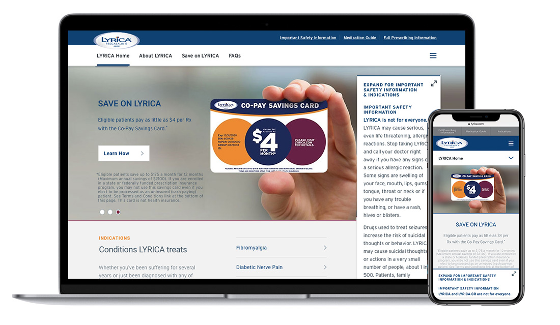
LYRICA.COM
Lyrica is a drug with multiple indications and needed a cohesive branded site that could also be flexible enough to provide each indication with it’s own specific content. Lyrica wanted to establish a master brand identity for the digital space since the drug would be going off patent in 2019. With the main indications having very different campaigns, we needed to find key elements that could unify the indications without disrupting their established and successful campaigns. It was also important to create easily accessible and search optimized savings content that would work across the site since that’s what people were looking for most.
FLEXIBLE TEMPLATES and Elements
While the Diabetic Nerve Pain, Fibromyalgia and other indication home pages look similar, they carry through their own campaign imagery while maintaining consistent Lyrica branding. We took the colors and dot elements from the logo to create a design system of branded elements and different types of content modules. These dots would later be used as mnemonic elements in the tv campaigns and banners.


